

Emotional Design is about designing products, services, and experiences to achieve specific emotional outcomes, usually positive.
The bottom line is that emotions are a big part of our brain’s system for driving behavior. Most of the time, the reason people are trying to do something at all (including engaging in your product/service) is to improve their well-being.
There are several really important reasons that designing for emotion is critical:
- Generally, achieving goals doesn’t create the emotional improvement we expected. (See “Stumbling on Happiness” by Daniel Gilbert.)
- Generally, it’s possible to greatly improve emotions without achieving any outward goals.
- Negative emotions consume people’s pool of willpower & patience with your product.
This means that your product could be excellent at achieving its stated purpose, but still not feel great to use, which means people won’t use it much.
In fact, I very often see products making design choices that actually negatively impact the user’s mood for no good reason.
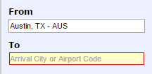
My favorite example is the feedback on form fields. Here’s a sample from Southwest.com:
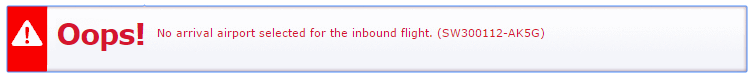
Here’s what drives me crazy about this feedback:
I’ve simply forgotten to complete a form field, there’s no need to throw a fit:
- Don’t use tons of red. Red = police lights, stop signs, blood & errors on school papers. This is not a big deal.
- Don’t use exclamation marks – especially not two. This is not a big deal.
- Don’t invoke the triangle warning road sign. There is nothing dangerous to warn me about.
- Don’t use interjections, like Oops (“meaningless words that express strong feelings”), especially in a giant, bold, red font with an exclamation mark.
- Don’t include intimidating error codes in line with user copy (especially in red).
- Speak in forgiving, friendly language. This message is very gruff.
- And, if you insist on using red, can you at least go less bold and pick a much friendlier shade of red?
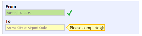
All of these design choices increase the user’s anxiety when all that was necessary was to clearly, unemotionally draw attention to the need to complete a part of the form they missed.
In addition, the designer missed the opportunity to emphasize what was done right.
Here is my take:
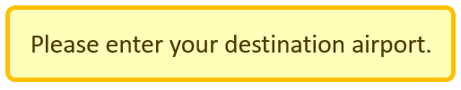
And while we’re talking about forms, you can greatly improve your user’s experience with these best practices:
- Inline validation: Let people know right away if there is something wrong with the field they are currently editing.
- Forgiving input: Let people enter dates in a variety of ways, and be smart enough to tell that 7/1/1971 is the same as 07 01 71
- Smart defaults: If 90% of your users are in the US. Default to the US in the country field.
Where have you seen design impact emotions positively or negatively?
What would you add to my comments? What did I get wrong? What did I get right?